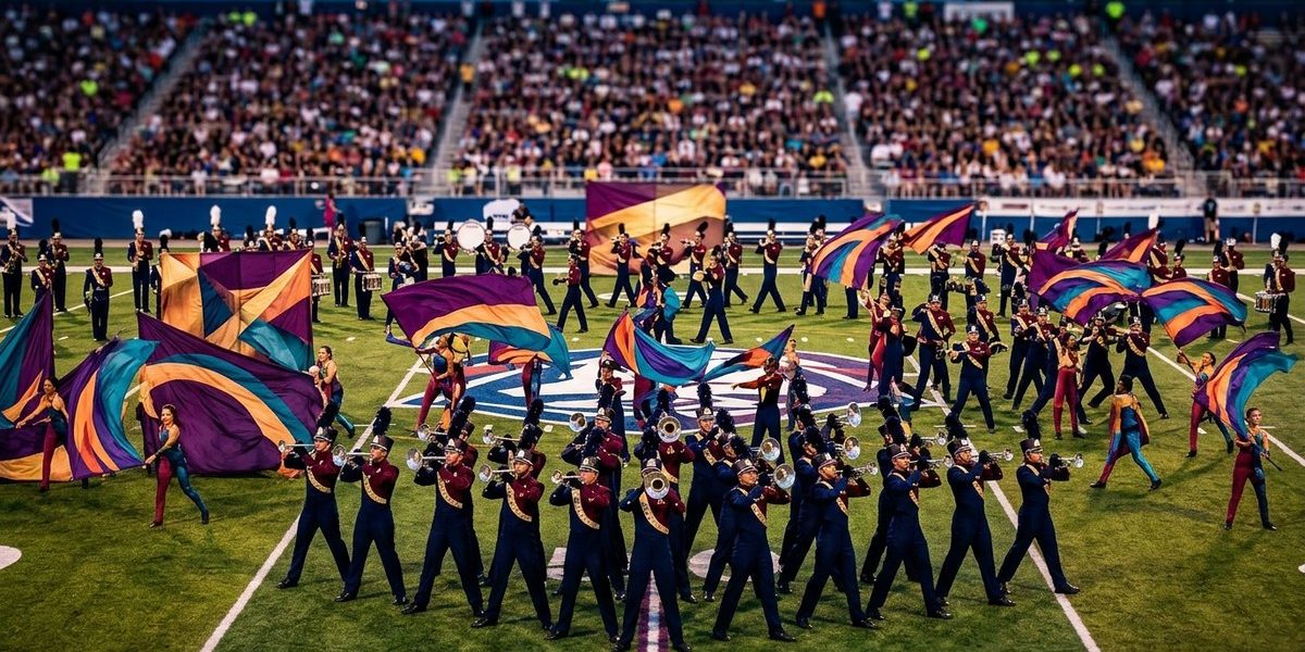
The 1995 Drum Corps International season didn’t just crown a champion; it rewrote the rulebook for visual design. If you watch a show from 1994 and then one from 1996, the difference hits you immediately. The drill moves differently. The spacing changes. The storytelling becomes more fluid. Something clicked in 1995, and that something was the Cadets’ “The Zone” combined with a shift in how judges evaluated visual performance. For anyone who studies drum corps history, this season represents a clear before and after moment.
The 1995 season pushed visual design from rigid, symmetrical formations toward organic, field-filling motion. The Cadets’ championship show “The Zone” used wide spacing and constant movement that forced judges to re-evaluate what visual excellence looked like. This single season sparked a decade of innovation in drill writing, staging, and performer movement that still echoes in today’s shows.
What Visual Design Looked Like Before 1995
Through the early 1990s, most top drum corps relied on what many fans call “checkerboard” drill. Corps moved in tight, evenly spaced blocks. Lines were straight. Curves were predictable. The focus stayed on crisp, military-style maneuvers that showed discipline and uniformity. Visual judges rewarded precision above all else. A show with perfect 8-to-5 step sizes and no collisions could score well even if the drill layout felt predictable.
But something was shifting. Think about the 1994 season. The Blue Devils and the Cadets both experimented with wider intervals and more angular shapes. Yet the judging sheet still valued traditional drill execution. Corps designers knew they could push further, but they needed a visible breakthrough. That breakthrough came in 1995.
How the Cadets’ “The Zone” Brought a Visual Revolution
The Cadets’ 1995 production leaned into a concept that designer George Zingali called “the zone.” The drill abandoned the standard 4-step spacing that had dominated drum corps for decades. Instead, performers often stood 6 to 8 steps apart. This created an open, airy look on the field. The corps could appear and disappear in unexpected ways. Musical phrases were supported by visual gaps that changed the audience’s focus.
Here is a table that highlights the major differences between pre-1995 visual design and what emerged after 1995:
| Pre-1995 Visual Design | 1995 and Beyond Visual Design |
|---|---|
| Tight intervals (2-4 steps) | Wide intervals (6-8+ steps) |
| Symmetrical block formations | Asymmetrical organic shapes |
| Constant step size (8-to-5) | Variable step sizes for effect |
| Strict uniform spacing | Purposeful gaps for visual impact |
| Drill focused on precision | Drill designed for storytelling |
| Minimal body movement | Integrated dance and fluid motion |
The data speaks for itself. The Cadets’ drill in 1995 looked nothing like the shows that had come before. It forced judges to ask a tough question: “Should we reward the ability to stay in a tight line, or should we reward the ability to create a moving visual canvas that complements the music?” The answer, by the end of the season, was the latter.
The Rule Change That Made It Official
In 1995, DCI introduced a new visual caption called “Visual Design.” It split the visual score into separate categories for achievement and design. This change gave designers an incentive to take risks. Before, a corps could win by simply executing a safe drill with high precision. After 1995, a corps needed both strong execution and a visually creative package. The Cadets scored highest that year because they won both the Visual Achievement and Visual Design captions.
This rule shift signaled to every design team that the old ways were no longer enough. Corp designers started looking at what the Cadets did and asked, “How can we make that our own?” The result was a rapid evolution across the activity.
Other Corps Respond to the New Visual Standard
The 1995 season also saw the Blue Devils push their visual design to a more sophisticated level with their show “Carpe Noctem.” They used layered staging and complex transitions that matched the new scoring emphasis. The Cavaliers, who had always been known for their precise drill, began experimenting with more abstract forms. Even lower-finishing corps started adopting wider intervals and more fluid motion.
Let’s break down three specific innovations that appeared within two years of 1995:
- The spread drill became standard in opening and closing moments
- Choreographed body movement (like head turns and arm extensions) became part of the drill, not just a separate effect
- Props and field art started appearing to define space rather than just fill it
These changes were not accidental. They directly responded to the visual design scoring shift that 1995 kicked off.
What Designers Learned from 1995
If you are a student of marching arts design, there are clear lessons from this turning point. Here is a step-by-step process that modern designers use, rooted in the 1995 model:
- Start with the music – Let the phrasing determine spacing and flow, not the other way around.
- Use negative space – Leave intentional gaps so the audience can see through the formation and focus on key performers.
- Vary step sizes – Do not march every phrase at 8-to-5. Change tempo and interval to match dynamics.
- Integrate body – Add head angles, instrument carriage changes, or upper body motions that reinforce the musical line.
- Test from the stands – Have someone watch from the press box to see if the visual picture translates to a distant view.
These steps might seem obvious today, but before 1995 almost no one used them systematically.
Expert Insight on the 1995 Impact
“What 1995 taught us is that visual design is not about filling every inch of the field all the time. It is about making choices that serve the music. The Cadets showed that you can create more impact by doing less. Their drill had breathing room, and that breathing room became part of the story.” – A longtime visual caption head who worked with multiple championship corps
The quote captures the essence of the shift. Visual design moved from “how much can we do” to “when should we not do something.”
The Lasting Legacy of 1995 Visual Design
Fast forward to 2026, and the fingerprints of 1995 are everywhere. Walk into any drum corps show and you will see wide intervals, purposeful spacing, and drill that ebbs and flows like a living canvas. The Cadets’ 1995 approach set a template that later shows like Bluecoats 2014 “Tilt” and Carolina Crown 2013 “E=mc²” built upon.
If you want to understand why modern drum corps looks the way it does, start with 1995. That season cracked open the door for designers to think differently. It proved that risk pays off when the design serves the music and the storytelling.
For anyone studying visual design today, watch the 1995 finals tape. Pay attention to how the Cadets use empty space. Notice when they move and when they hold still. Compare it to a show from 1994, and the shift becomes crystal clear.
Now pull out your old practice field coordinates or open up a drill design software. Try writing a short segment with 8-step intervals instead of 4. Use that negative space on purpose. You may just feel a little of what Zingali felt back in 1995. That is the turning point that keeps turning.
If you enjoyed this analysis, check out our feature on how the Cadets pioneered visual storytelling and changed drum corps forever. For a broader look at the era, read about 5 drum corps shows that redefined the activity in the 1990s.