You are standing at the entrance of a massive exhibit hall. The air hums with conversation. Rows of booths stretch in every direction. Your eyes scan the space, and within half a minute, you already know which exhibits will win awards and which ones will blend into the background. That instinct is not magic. It is a skill you can learn. Championship-level trade show booth design reveals itself through specific visual cues that experienced managers and designers learn to read. The first thirty seconds tell you everything about a brand’s commitment to craft, clarity, and audience respect.
A championship-level trade show booth design announces itself in the first thirty seconds through three unmistakable signals: a single dominant focal point, deliberate negative space, and lighting that sculpts the environment rather than just illuminating it. These elements work together to create an immediate emotional response that separates award winners from the rest of the show floor.
The Opening Moment: What Your Eyes Register First
When you approach a booth, your brain processes the entire scene in a fraction of a second. You do not read text first. You do not examine product details. Your visual system looks for patterns, contrast, and hierarchy. A championship-level design exploits this natural instinct by giving your eyes one clear place to land.
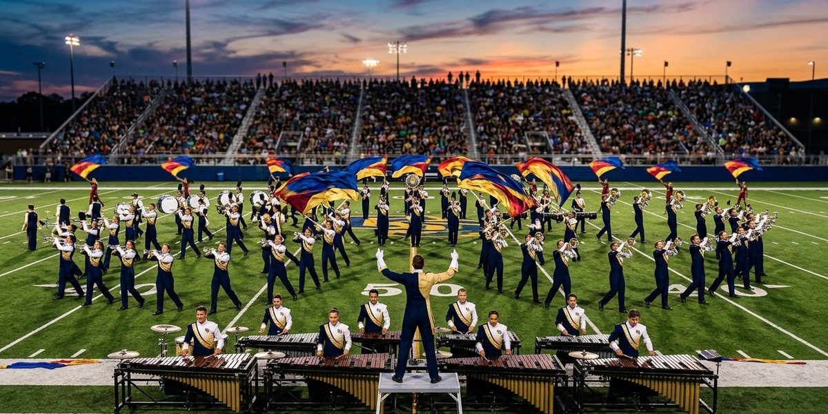
Think about the best drum corps shows you have seen. The opening hit does not try to show you everything at once. It gives you one powerful image. A single shape. A bold color. A moment of stillness before the motion begins. The same principle applies to booth design. The most effective exhibits present a single dominant visual element that anchors the entire space. This could be a large scale graphic, a dramatic sculpture, or a carefully framed product display. Whatever it is, it must be the first thing you see.
Walk up to a booth that wins awards. Notice how your eyes arrive at the same spot every time. That is intentional. The designer removed competing elements to create a clear entry point. If your booth tries to tell five stories at once, visitors will walk past all five.
Negative Space Is Not Empty Space
One of the hardest lessons for exhibitors to learn is that more does not equal better. Championship-level booths use negative space with purpose. Empty areas around a display give the eye room to rest. They make the content that remains feel important.
Compare a booth crammed with ten banners, three video screens, a product table, and a giveaway station to a booth with one massive backdrop, a clean demo counter, and open floor space. The second booth feels more expensive. It feels more confident. It suggests that the brand knows what matters and is not afraid to let the audience breathe.
This is where many experienced trade show managers struggle. You want to maximize every square foot. But the best designers know that empty floor space is not wasted. It is a tool. It directs traffic. It creates a sense of arrival. It signals that your brand is not desperate for attention.
Lighting That Shapes, Not Just Brightens
Standard booth lighting is flat. It comes from overhead fixtures that wash everything in the same dull glow. Championship-level design treats lighting as a sculptural element. It uses pools of warm light to highlight products. It uses cool backlighting to create depth. It uses spotlights to draw attention to the focal point.
Walk through any major trade show and notice the difference. The booths that glow from within, the ones that seem to pop off the floor, those are the designs that invested in layered lighting. They understand that light creates mood. It tells your brain where to look and how to feel about what you see.
A simple test: if you can stand in a booth and see every surface lit the same way, the lighting is not doing its job. Championship-level booths have shadows. They have highlights. They have moments of brightness that contrast with moments of calm.
The Three-Step Visual Audit
You can train yourself to evaluate any booth in thirty seconds using this simple process. Practice it at your next show.
-
Find the focal point. Stand still and let your eyes move naturally. Where do they land first? If you cannot identify a single dominant element, the design lacks hierarchy. If your eyes bounce between three different things, the design is cluttered.
-
Assess the breathing room. Look at the space around the focal point. Is there enough negative space to let that element stand out? Or does the booth feel like a crowded shelf? Count the number of separate visual messages you can see from your standing position. If the number is more than three, the design is trying too hard.
-
Evaluate the light quality. Notice where the brightest areas are. Are they highlighting the most important content? Or is the light spread evenly across everything? Championship-level booths use light to create a visual path from the entrance to the main attraction.
What Championship-Level Design Looks Like in Practice
Here is a breakdown of techniques that separate award-winning booths from the rest. Use this table as a reference when you review your own designs.
| Technique | Championship-Level Approach | Common Mistake |
|---|---|---|
| Focal point | One large, high contrast element that dominates the sightline | Multiple medium sized graphics that compete for attention |
| Negative space | At least 40 percent of the visible area is open or calm | Every surface covered with messaging or product |
| Lighting | Directional spotlights and backlighting create depth | Overhead fluorescent wash with no variation |
| Color palette | Two to three colors used consistently across all surfaces | Six or more colors that create visual noise |
| Text hierarchy | One headline visible from 20 feet away | Paragraphs of body text that require close reading |
| Traffic flow | Clear entrance and exit paths that guide movement | Open sides that let visitors wander without direction |
The Rhythm of the Show Floor
A great trade show booth has a rhythm. It pulls you in, gives you a moment to absorb, and then invites you forward. This is not different from the pacing of a championship drum corps performance. The best shows do not blast you with sound from the first note to the last. They build. They pause. They give you space to feel the impact of each moment.
Your booth can do the same. The first thirty seconds are the opening statement. They set the tone. They tell the visitor whether this is a brand worth their time. If the opening is chaotic, they will walk past. If the opening is clear and confident, they will step inside.
“The most common mistake I see in booth design is the fear of empty space. Designers fill every inch because they think it shows value. But the opposite is true. A confident design uses emptiness to make the important things feel important.” — Sarah Kline, exhibit design consultant with 18 years of experience judging trade show awards
A Practical Process for Evaluating Your Own Booth
Before your next show, run through this checklist. It will help you spot weaknesses before visitors do.
- Stand at the entrance of your booth and take a photo with your phone.
- Look at the photo for five seconds. What do you see first?
- If the answer is not your primary product or your main message, you have a focal point problem.
- Count the number of separate graphic panels. If the number exceeds three, consider combining them.
- Turn off the overhead lights and use only your accent lighting. Does the booth still look intentional?
- Ask a colleague who has never seen the booth to walk toward it and tell you what they notice first. Listen to their honest answer.
Why the First Thirty Seconds Matter More Than Ever
Attendees at trade shows in 2026 have shorter attention spans than ever. They are bombarded with information from the moment they enter the building. They make decisions about where to stop based on instinct. Your booth does not get a second chance to make a first impression.
The brands that win awards understand this reality. They design for the glance. They know that a visitor will decide whether to engage within the time it takes to walk past three other booths. That is approximately thirty seconds. If your design does not communicate clearly in that window, you have lost the opportunity.
How to Build Championship-Level Design Into Your Next Booth
You do not need a massive budget to apply these principles. You need discipline. Start by reducing the number of messages you try to communicate. Pick one. Make it bold. Make it visible from across the aisle.
Next, remove anything that does not support that single message. If a graphic, a prop, or a display piece does not directly reinforce your focal point, take it out. Be ruthless. The empty space you create will make your booth feel larger and more premium.
Finally, invest in lighting. Even a simple track lighting system with adjustable spotlights can transform a basic booth into something that looks high end. Point the lights at your focal point. Dim everything else. Watch how the booth comes alive.
For more on how structured routines build consistency, check out our guide on building a perfect 30-minute individual practice routine. The same principle of focused repetition applies to refining your visual presentation.
When You Watch the Best, You Learn the Standards
Every year at the major trade shows, certain booths stand out. They are not always the largest. They are not always the most expensive. They are the ones that understand the visual language of the first thirty seconds. They command attention without shouting. They invite curiosity without overwhelming.
If you want your booth to be one of those, start by studying the best. Walk the aisles with a critical eye. Time yourself. Notice which booths grab you and which ones fade. Then apply those lessons to your own space.
The Final Measure of Championship-Level Design
A championship-level trade show booth design does not need to explain itself. It communicates instantly. It respects the visitor’s time. It uses every element with intention. And it leaves a lasting impression that extends far beyond the first thirty seconds.
The next time you prepare for a show, step back and look at your booth the way an attendee would. Give yourself thirty seconds. If you cannot identify the message, the focal point, and the feeling the space creates, keep editing. When you can, you will know you are ready.